React Native 환경 설정
먼저 React Native를 잘 모르시는 분은 아래 오래전 포스팅을 참고해주세요.(저의 포스팅은 아닙니다.OTL)
https://bravenamme.github.io/2019/10/17/react-tutorial/
기초 레이아웃
먼저 레이아웃을 잡을때 중요한 flex를 알아야 합니다. (안드로이드의 LinearLayout 의 weight 과 동일합니다.)
아래 코드를 먼저 보시죠.
const styles = StyleSheet.create({
    container: {
        flex: 1,
        flexDirection: 'row', // 세로배치는 'column'
    },
        item1: {
        flex: 1,
        backgroundColor: 'red',
        },
        item2: {
        flex: 1,
        backgroundColor: 'blue',
        },
        item3: {
        flex: 1,
        backgroundColor: 'green',
        },
});
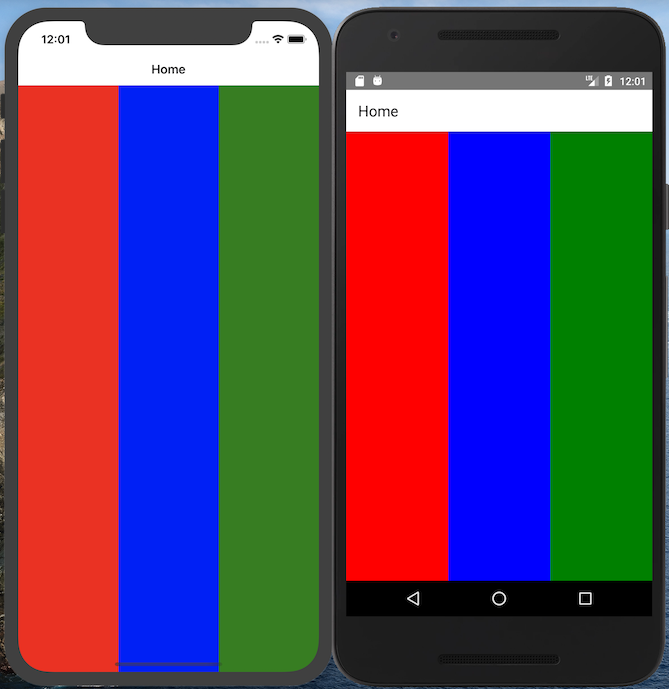
제일 상단에 container가 존재하고 flexDirection를 활용해 자식뷰의 정렬을 가로로 배치할지 세로로 배치할지 방향을 정해줍니다.
자식뷰는 총 3개이고 모두 flex가 1 인 경우 container의 사이즈를 3등분 해서 가져가게 됩니다.(참 쉽죠?)
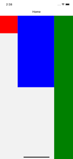
flex 대신에 width와 height 또는 %로도 가능합니다
const styles = StyleSheet.create({
container: {
    flex: 1,
    flexDirection: 'row', // 세로배치는 'column'
},
    item1: {
    width:100,
    height:100,
    backgroundColor: 'red',
    },
    item2: {
    width:"50%",
    height:"50%",
    backgroundColor: 'blue',
    },
    item3: {
    flex: 1,
    backgroundColor: 'green',
    },
});
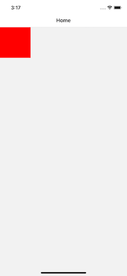
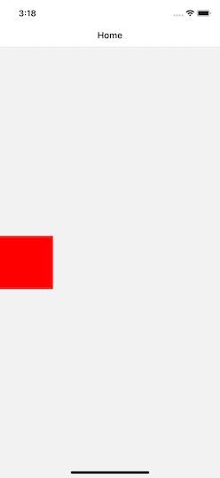
Align items
Align items은 위에서 언급한 Flex Direction 에 수직한 방향으로 배치됩니다.
즉 Flex Direction이 column일 경우 Align Items는 세로 정렬이 되고, row일 경우 가로 정렬이 됩니다.
Align items 는 flex-start, center, flex-end, stretch, baseline의 총 5가지로 배치할 수 있습니다.
이름으로 부터 알 수 있듯이 flex-start는 시작지점, center는 가운데, flex-end는 끝지점을 의미합니다.
const styles = StyleSheet.create({
container: {
    flex: 1,
    flexDirection: 'row', // 세로배치는 'column'
    alignItems:'flex-start',
},
    item1: {
    width:100,
    height:100,
    backgroundColor: 'red',
    },

});

const styles = StyleSheet.create({
container: {
    flex: 1,
    flexDirection: 'row', // 세로배치는 'column'
    alignItems:'center',
},
    item1: {
    width:100,
    height:100,
    backgroundColor: 'red',
    },

});

const styles = StyleSheet.create({
container: {
    flex: 1,
    flexDirection: 'row', // 세로배치는 'column'
    alignItems:'flex-end',
},
    item1: {
    width:100,
    height:100,
    backgroundColor: 'red',
    },

});
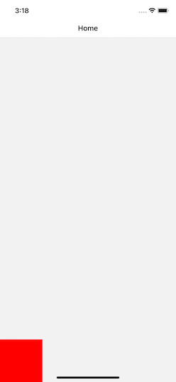
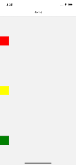
Justify Content
Align items가 Flex Direction 에 수직한 방향이라면 Justify Content은 수평한 방향으로 배치됩니다. 하지만 Align Items과 약간 다릅니다.
flex-start, center, flex-end는 동일하지만 space-between, space-around 배치 방식이 있습니다. 간략하자면 between 는 양쪽 정렬, space-around 마진이 존재하는 양쪽 정렬 입니다.
(IOS에 StackView와 비슷합니다.)
const styles = StyleSheet.create({
  container: {
    flex: 1,
    justifyContent: 'space-between',
  },
  item1: {
    width:50,
    height:50,
    backgroundColor: 'red',
  },
  item2: {
    width:50,
    height:50,
    backgroundColor: 'yellow',
  },
  item3: {
    width:50,
    height:50,
    backgroundColor: 'green',
  },
});
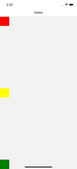
const styles = StyleSheet.create({
  container: {
    flex: 1,
    justifyContent: 'space-around',
  },
  item1: {
    width:50,
    height:50,
    backgroundColor: 'red',
  },
  item2: {
    width:50,
    height:50,
    backgroundColor: 'yellow',
  },
  item3: {
    width:50,
    height:50,
    backgroundColor: 'green',
  },
});
여기까지가 레이아웃의 기초 입니다. 다음 시간에는 조금더 복잡한 레이아웃을 다루어보도록 하겠습니다.
다음에 만나요!